Visual Recognition Cooking App
Cookit
Problem
How might we help people to cook what they want?
Client / Year
Personal / 2017
Duration
5 Weeks
Skills
UI/UX, Prototype, Visual Design, Branding, IA
Tools
Photoshop, Illustrator, Sketch, After Effects,
Origami Studio
Description
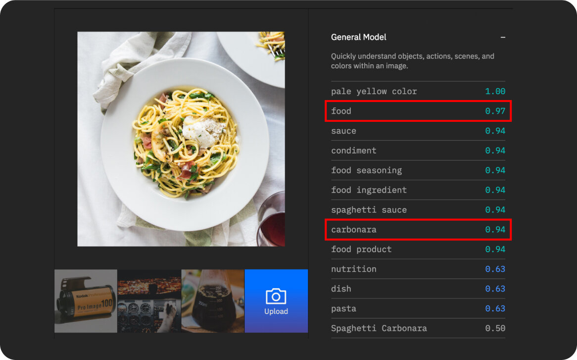
The idea simply started from 'What if there is a camera that scans a photo of food and provides recipes using visual recognition technology?'. Cookit will help the users to build their own collection of the recipes.
Challenge
The biggest challenge while I'm working on this project was how to differentiate from other cooking apps. I designed the Cookit to be the food version of Shazam.
Product idea
Capture your recipes
The only CTA available for the user is ‘Save For Later’ on the scanned page, because the user have the food in front of them already and they are about to enjoy the food. The main purpose of this app is to save, revisit and cook..


We take pictures of food and remember if it was delicious or not. A lot of cooking apps tell us to try their recipes that we don't know anything about it, but instead, Cookit let people cook what they remember and want to cook.
Insight

Technology
Visual Recognition understands the contents of images. Analyze images for scenes, objects, faces, colors, food, text, explicit content and other subjects that can give you insights into your visual content.

Competitive Analysis
Analyzed three competitors after conceptualizing the Cookit to make UX better.
Kitchen Stories: Minimal design make the food stand out more. Best looking visual out of three competitors. It has less options and functions. It's easy to use. Simple How-to videos are clever that it's great for beginners.
Yummly: It’s the only app that has allergy and preferences options. Users can shop ingredients directly from the app. Most personalized product. Clutter and heavy drop shadow designs make the food look less tasty.
FoodNetwork: Variety of chefs' recipes are available. It's most general product designed for all different target users. Vast amount of recipes. Unorganized (No steps, bullet points, etc) text direction make it harder to follow.
Initial sketches
UX Flow & Visual Design
I organized essential options and UIs I learned from competitive analysis on the paper before designing on the screen to clarify what's needed. Roughly sketched sitemap out to build IA.
The initial wireframes and design shows the flow and the main features of Cookit, which are taking a photo and saving a recipe. On this stage, I started to build the branding, the voice of Cookit, such as colors, typography, and UI elements.
The final icon, a camera lens & a plate from aerial view led to 'What would you capture?' campaign idea by showing numbers of food photography taken from aerial view. It inspired me to use more circular icons, UIs, and logo to correlate the branding.

Captured card revisions
1. Initial UI with 4 icons, time, steps, ingredients, and difficulty.
2. After a user testing, I learned that users would care more about time over how many steps.
3. After another user testing, I found a UX problem that users need an extra photo of captured recipe.

Selecting flow revisions
I tested the selecting a recipe flow with 10 people and only 20% recognized that there are multiple recipes from one picture. Most of them thought the second picture was an another picture, like gallery. V3 is a card design that each card has name of the recipe. When I tested V3, 10 out of 10 people recognized it was a different recipe.


What If?
What if restaurants share their recipes on Cookit?
What if MealPal and Blue Apron make a partnership with Cookit?
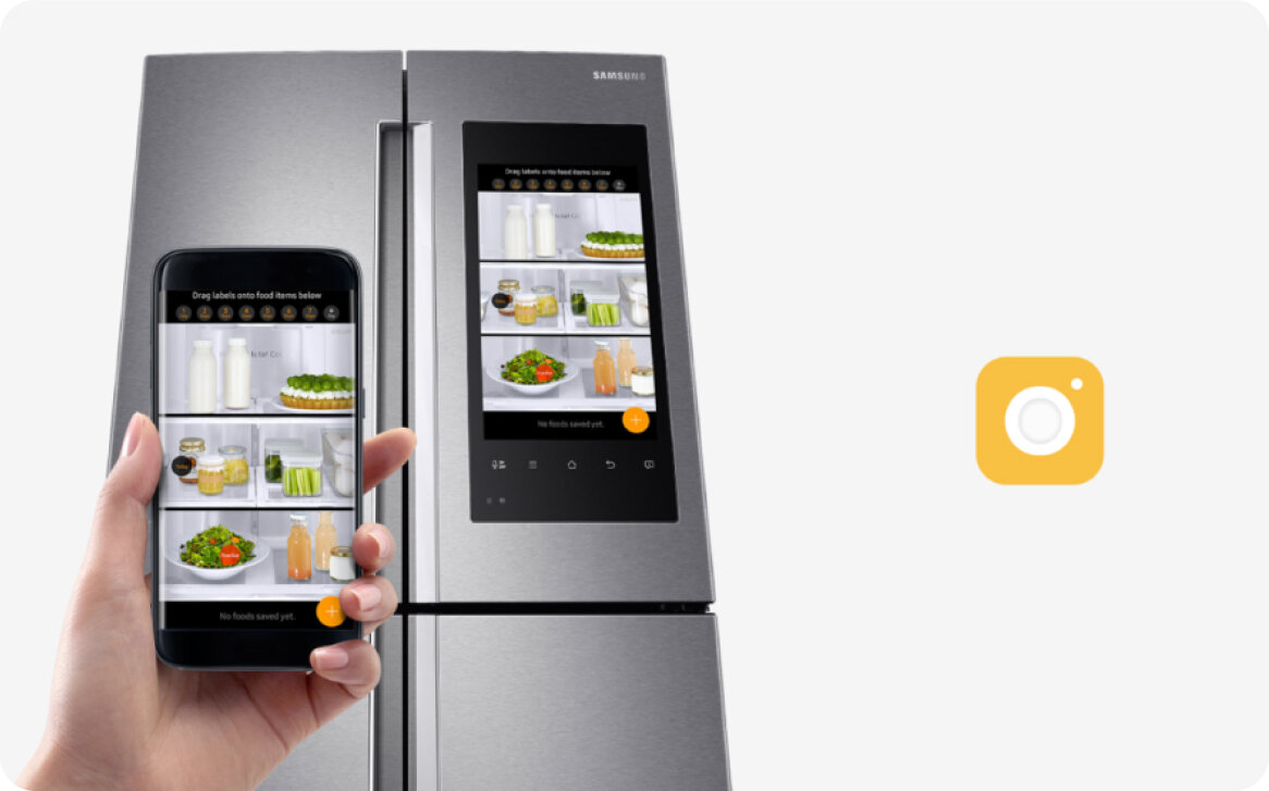
What if Cookit can sync with smart fridge?


